My Go-to Style for Panels in Service Portal
In the process of designing custom Service Portals for my clients, I've come across a few tried-and true styles that I find work well in just about every situation. Today I'm going to share one of these styles that I use for a clean, timeless, and flexible look. I use this style as an alternative to the Bootstrap panel component found throughout the out-of-box (OOB) portal, and I've found it to be a perfect solution for showcasing any information we want to give it's own space.
Bootstrap Panels in Service Portal
First, a little more about Bootstrap panels. At it's core, the Bootstrap panel is just a box you can put stuff in. Like a list of records. Or search results. Or pictures, buttons and links. Whatever you need. Even Bootstrap says so:
"By default, all the .panel does is apply some basic border and padding to contain some content."
Additionally, the Bootstrap panel comes with the ability to add a heading and a footer, which is how it typically looks when we come across it in Service Portal.
The Clean-Panel
This style begins with a clean outer container: the box we will put "stuff" in. You'll notice in the image that the page background is not white. While you can use this style on a white background, I prefer to set the background color of my page or container to a light grey or a very light shade of my primary brand color. This helps the panel and the information it contains pop out on the page, making it more noticeable for our users.

In addition to using the background to our advantage, notice the lack of substantial border. I've used a slight drop shadow and barely-there grey border, to create just enough separation between the widget content and the rest of the page. Additionally, the drop shadow serves to "lift" the panel off the page just a bit. This gives your page a sense of depth, and keeps the page from looking too flat.
Last, the border-radius is set to zero, purely as a preference of mine. I like how crisp sharp corners tend to make a page look. Definitely not a hill I'll die on though. OOB panels have a 4px border-radius.
Our CSS for this panel
.clean-panel{
    box-shadow: 2px 2px 4px 0 rgba(0, 0, 0, .15); /* Sets drop shadow */
    background-color: $panel-bg; /* Set in Portal SCSS variables */
    border-radius: 0; /* Cause I like sharp edges */
    border: 1px solid $gray-lighter; /* subtle border to finish it off */
    display: flex; /* Helps with how content is displayed */
    padding: 15px; /* Give your content space to breathe */
    flex-direction: column; /* Keeps the heading and body from trying to sit beside each other */
    margin-top: 30px; /* honestly this is here so I could get a better screenshot. YMMV */
}
Clean Panel Content: Add some "stuff"
As I said, most Service Portals utilize the typical heading-body-footer panel style, so next we're going to add some content to our panel with these three areas for sake of comparison.
First, the panel heading. As the title of the widget, you usually won’t avoid adding this. I like to use a larger font size to really call attention to what this widget is all about, as well as a bottom border for a punch of color. Notice I'm using the brand colors in small doses here. We don't want to overdo it and cause our users to see the colors and ignore the content. This semi-complete dividing line also serves to separate our heading from the actual content (the OOB panel does this as well).
.cp-title{
  border-bottom: 2px solid $brand-primary;
  padding-bottom: 5px; /*Puts space between your title and the border*/
  width: 100%;
}
For sake of brevity, I've added some good ol' lorem ipsum to fill out our panel body. Normally, this is where you'll add the primary content you want your user to see and act upon, be it a list of records, group of Service Catalog items, links, or even a search bar. Notice that I've put another layer of padding around our content. It's just 15px, but it's enough to inset the content and create a great visual hierarchy. Our users will easily be able to see the heading as the title, and that everything in the panel has to do with our widget's title. The footer, on the other hand, aligns with the header to better indicate that it is relevant for the content body as a whole.
Last, I've put some action buttons in our panel footer. Much like the dividing line between the heading and body, the top border of the panel footer does not entirely connect across the width of our containing box. A subtle line here is all that's needed to create enough of a barrier to let the content of each section stand on its own, and give enough space around each so the entire effect isn't cluttered. Remember, every line and element you put into a panel is something our users have to consider, even if for a fraction of a second. Good design, in part, is ensuring we have removed as much “visual clutter” as possible.
Tips for Implementing this Style
Remember, this style is built to help your users make a decision about what part of your page they need to interact with. Use this style to group similar items together.
Try to mix up the content on your page, some within the panel, some outside. Though the examples below make heavy use of panels, your designs may do well if some information is sitting outside the boundaries of a panel. A panel’s borders create lines of separation you can use from outside the widget as well as inside.
Limit how many items you place in a panel for a user to consider at one time. Five to seven Service Catalog items are easy to choose from. Twenty can be overwhelming.
Whether you’re using this panel style or the OOB panels, if you want to put panels side by side, try to vary the types of content that are next to each other. Three lists of records similarly styled will all run together for your user for lack of distinction, leaving them with one big blob of choices to decipher.
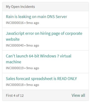
The Clean Panel at Work
Below are a few examples of ways I have used this style in the past. In some of the examples, I’ll put the color on the top border of the panel. This is especially effective if you have elements that have their own defining lines, such as buttons.


As you can see, the clean panel is a flexible enough for a number of purposes in Service Portal, and I’ve found it to be a good approach to freshen up even a simple ITSM implementation. I encourage you to look at this not only as a definitive style you can use, but also as inspiration for new ways of showcasing information. If you’d like to access the update set for the widget I created for this post, feel free to download it here.
Got questions or feedback?
Found an alternative style for grouping information in Service Portal? Anything you want to see me cover? Feel free to reach out, I’d love to hear from you.