Four Header Styles that will optimize your Service Portal Navigation and Look Good Doing It
Ahh the Service Portal header widget… the first thing we see, and one of the often forgotten elements when we look to customize a Service Portal for our clients and organizations. More often than not, this ever-present, essential element of our portals is left to its out-of-box self.
But do we really have to leave it like that? No, we don’t!
While headers tend to be one of the more painful widgets to put together in Service Portal, it can also be one of the most rewarding places we can enhance the user experience with appropriate styling, a stellar mobile experience, and well-structured navigation that gets our users where they need to go. Below are five examples of different headers (or navigation menus) I’ve found out in the wild for you to consider using in your next Service Portal project.
The Landing Page
Starting us off is the header layout that keeps us close to home as it appears in the out-of-box ServiceNow Service Portal.
I call this layout the “Landing Page” because it’s simple design and minimalistic approach is favored by many a website and web app. It features a classic layout with a left-aligned logo and an otherwise-aligned short list of menu items. Dropdowns on these headers tend to be smaller, with only one or two levels of menu options, though some sites opt for large mega-dropdowns.
ServiceNow’s Developer Program Home
Site: developer.service-now.com
Most of us have seen this site a hundred times (or more). This is a good example of what a little theme-level CSS can do for the stock header widget. The typeface and font-size have been amended for better legibility, with a white background that is seamless and clean. This is one typical layout where you’ll notice that the majority of navigational menu items have been moved to the left side of the navbar, next to the logo. The right side of the navbar is reserved for a search function and sign-in / profile features.
Tunnel Bear
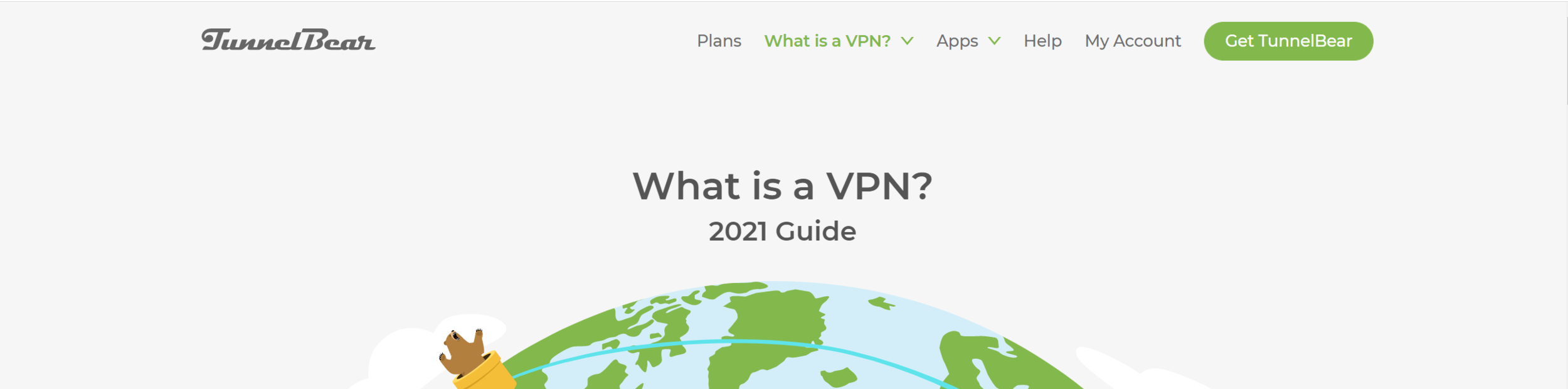
site: tunnelbear.com
Tunnelbear uses a simple technique that blends the navigation bar into the hero / welcome, where we typically see the search bar and welcome message. The background on the header is either the same color as the welcome container, or transparent with the welcome container moved up via negative margins. Tunnelbear has opted to keep the menu right-aligned, opposite the logo.
Another idea: where many websites use the CTA (call to action) button in their navbar, consider what most-used service might be a good candidate for that prime real estate. A note for nailing this approach: remember that whatever color you choose for the navbar background will persist on every page throughout your portal. You can use CSS to alter this so it’s a different color on the homepage if need be, but be aware in case you don’t want the header to be transparent on secondary pages.
Also, extra points for the rad bear illustrations.
Sweatcoin
Site: sweatco.in
Sweatcoin uses a really neat approach that requires the transparent navbar background I mentioned above. Their site is single page, with no dropdown menus. Here I’ll caution you to ensure your text is accessible and legible by ensuring there is appropriate color contrast between your background color and text / link color. Notice on all of these examples, that even with some changing color, there is minimal content in the background of the navbar to prevent distraction. Noisy patterns and images will hinder your users here; opt for images with lots of empty space at the top.
The Landing Page: Tips for Implementation Success
Limit the number of top-level navigation menu items.
It’s easy to create a long menu in the header. Remember that your users will access the site from many different browser window sizes and devices, and a long list can get crowded, difficult to navigate, and do weird line wrapping things when there are too many items and not enough space. If needed, use dropdown menus or consider one of the below more extensive header options for a larger navigation menu.
Ensure proper color contrast between text and background.
I can’t say this enough. Don’t hurt your user’s eyes with text that is hard to read on a noisy background (like a picture with faces or multiple colors and lines), or text that on hover, is barely different than the background color. Users with vision impairments will thank you for making their lives easier. You can test the legibility of your menu items using the color blindness simulator tool found here.
Minimize the number of features to one or two.
Be careful not to overload your user with choices in the header. In addition to the logo and menu, maybe you want to add a search bar or a high-priority action button. If you do, consider minimizing the search bar to expand on hover/click, or choose only one feature to add. Minimalism is key to keeping this style orderly and easy to navigate.
The Double Decker
As its name implies, the “Double Decker” is a header with two levels of navigation. Usually the two levels split into true site navigation on the second level, and more utilitarian features, such as login or search, up top.
Twilio

site: twilio.com
Many public sites use this layout to provide potential customers with easy access to contact information. Twilio has taken this route, along with providing access to support and login access on the top bar. This keeps your main site navigation from becoming cluttered with more functional links. In the case of websites looking to attract customers, this helps separate the links that will lead to new customers from tools that assist existing customers. For our purposes, placing the login / profile functions in the top bar can give you more room to flesh out the navigation for a larger portal.
YNAB (You Need a Budget)

site: youneedabudget.com
YNAB is a personal finance tool for household budgeting. Their website’s main navigation splits up functionality a little differently. The top bar is the actual site navigation, laid out similar to the “Landing Page” method mentioned above, with a limited number of high-priority menu items, login, and search functionalities. The second menu, which is more readily visible and showcases the logo, changes to reflect content specific to different areas of the site. It’s almost a different way to show dropdown menu items, that keeps things (again) orderly and not too overwhelming for the user (again, both bars have a limited number of items, 3-5 ideally).
As a bonus, I’d like to point out that the styles they use for active menu items and on hover are pretty sweet. As you’re designing out your header, remember to consider different styling for different states of your menu links. It should be obvious to the user what part of the site they are currently viewing, and when they are hovering over a link that will take them to another page. My favorite ways to implement this includes underlining text, or changing the font weight, background color, or text color.
Lastly for this example, a word on mobile. As I always preach, put your headers (and all of your widgets) together mobile first. Your users’ experience on a mobile device will be very different, and a header like this that works on desktop can be a cluttered nightmare on mobile if not handled correctly. Below, you’ll see how they handle their mobile audience, by putting many of the menu items behind a hamburger menu, leaving just the page-specific links visible.
The Double Decker: Tips for Implementation Success
Define a purpose for each navbar.
There are a number of different ways you can do this, and the above examples point out a few. Maybe one bar is functional, for search and login, and the other is your actual site navigation. Or perhaps the bottom bar is meant for your end users, and the top meant for your power users and admins. Whatever you choose, make it easy for your users to figure out where they need to be looking for any given item or content type you’ve placed in your header.
Give your user context clues.
Visually indicate to your users that an item will do something if they click on it via effects on hover, active, and focus. This is a great place for some fun animations, to “reward” your users for finding clickable content.
Don’t forget mobile.
Design your header mobile first, to ensure users can easily navigate your content, regardless of the device they use to access it. If you don’t I’ll send some bad CSS ghost to haunt you. Or something.
The Split Decision
At its core, the “Split Decision” header takes the Double Decker and sandwiches the two navigation bars with the welcome hero content. (I’m starting to sound like a deli menu, aren’t I?). This can be helpful for especially wide hero banners, or to provide more separation from an otherwise busy main navigation bar.
/sp
site: Your PDI
The OOB Service Portal has a navigation style that you don’t see often out in the wild. This is the basic layout of the Split Decision, with a functional, single-line header up top, followed by a hero, followed by a second navigation bar filled with the most-needed links.
cough and so this being from my PDI, I gave it a nice pattern from heropatterns once upon a time and didn’t bother to change it back.
Airtable
Site: airtable.com
Airtable uses their second navbar on select pages to serve as page navigation to deal with pages with large amounts of content. The links are pretty simple, and just serve to help you jump down to a particular part of the page. I could certainly see this type of navigation for a single page, though I’d caution you to make sure there is some kind of “return to the top of the page” functionality ready for the user as well.
Another potential use I see is with the Knowledge Base, where the second navbar allows you to easily browse among the different KB categories. For FastGov, the solution I’m building for state and local governments, I’d implement this to show content to different user personas, such as business, resident, visitor.
Duolingo
Site: Duolingo.com
First, we have to acknowledge how perfect the friendly, simple illustrations on this site are. SO CUTE. (Yes, Service Portals are allowed to be cute).
Now, the neat thing about the second navbar is that it scrolls. This works for a few reasons in this very niche use case.
First, all of the listed items are very, very similar. Like, flag icon, one word, that’s it similar. It’s extremely easy for the user to determine where one item begins and another ends. Be cautious about using this with say, your most popular Service Catalog items, if the titles are extremely different in length.
Second, check out this site on mobile. From what I can tell in Chrome, that second navbar disappears. Because the content in this navbar is optional (there are many other ways on this page to access the same content), it’s a nice-to-have on the larger screens, but is removed on mobile so as to not provide unnecessary distraction to the user. And that’s ok!
Similar in function to the out-of-box /sp, I like the more slim, sleek style that Duolingo gives us. Remember, in design of any type, less is more. Especially for a self-service site, where we want users to get in, get out, and get on with their busy days, we want to put in front of them exactly what they need, only when they need it. When more screen real estate is available, offering multiple doors that take you to the right place can do wonders for helping users with different mindsets find what they need.
The Split Decision: Tips for implementation success
Less is more.
Remember, on that second navbar, keep your choices succinct. The spread in navigational choices can prove to be taxing on your user if they constantly have to look above and below a large hero. As mentioned above, define a purpose for this second navbar, and be consistent about the purpose throughout the site.
Use only as needed.
“As needed” can mean a couple of things. In this case, there are two primary things you want to look out for. First, don’t feel the need to provide this layout on every single page. Especially for more functional pages (search results, ticket details, etc), the large hero can get tiresome. Second, carefully consider whether or not this functionality needs to be included on all screen sizes. If the content is otherwise provided to the user in other ways on the page, consider eliminating this second navbar on smaller screens, as DuoLingo implements. If the content is necessary, ensure smaller screens accomodate these links without impeding your user’s progress through the rest of your portal’s content.
No wrong door leads to all the right places.
Jumping off of point #2 above, remember, keep in mind the “no wrong door” approach to site navigation. Your users will come with many different mindsets, which means many different logical paths to get to a certain destination in your portal, be it a knowledge base article, service request, or other special functionality. Having multiple methods for a user to access your portal’s content will help accomodate users and the different paths they tend to take. The second navbar in the Split Decision header, is one of those places for an additional “door” your users can take.
The Sidebar
Maybe I should call this one the Side Dish?…Now I’m hungry. The Sidebar header layout is exactly that. The navigation menu moved from its usual haunt at the top of the site, to the left or right side of the screen as a vertical bar. While quite the departure from the other styles we’ve seen, there are a number of ways to successfully execute the Sidebar to ensure your users find it easy to access and use. As a bonus, there is ALL KINDS of fanciness you can do with sidebar navs.
Amazon
Site: Amazon.com
I hear our Service Portals compared to Amazon for navigation purposes quite often, so I thought this would be a good site to address. Amazon uses the sidebar on their site in addition to a “Double Decker” main navigation bar. There is a ton of functionality packed into their main site navigation, which allows users to browse in the way that is most comfortable with them, whether that be browse by category or search. Note that their sidebar is initially hidden from view.
Functionally, their sidebar is a secondary, optional way to browse site content. When the sidebar is in view, a dark overlay helps our user focus on just the content of the sidebar, to help prevent overloading the user with too many options. This is especially vital with how information-packed their main site navigation already is. Notice the clear visual hierarchy of information here: easy to read category headings help the user know whether or not the links underneath
A note about dropdowns, generally and on the sidebar menus: Bootstrap as it’s implemented in Service Portal, only allows two levels of dropdown menu in the out-of-box header menu widget. If you want more levels of dropdown, you’ll need to amend the widgets to accomodate.
City of Raleigh, North Carolina
Site: CityofRaleigh.gov
If you get me going, I can rant about bad web design in the state and local government space for DAYS (trust me, I timed it once). However, Raleigh, the capital of my beloved home state is not one of the sites to which I direct my ire. City and County websites tend to be packed to overstuffed with information, and navigation is a real challenge with dozens of departments, hundreds of content page, and the ultimate goal of helping the general public find exactly what they need.
Raleigh first presents their users with a very simple one-layer navigation bar with no dropdown menus, that directs users to major portions of the site. Notice the search function here is even minimized to keep the main navbar as clear of clutter as possible.
If you’re looking for more options, however, check out the hamburger menu placed neatly on the left-hand side of the page. On click, it opens up a new menu with an expanded list of options for major areas of the site. Notice that many of these items, instead of official department names, opt for something more user-friendly to the general public (“Trash, Recycling, and Clean Up” vs. “Department of Solid Waste”). On any navigation you choose to incorporate into your portal, keep in mind that for some organizations, traditional names such as “Knowledge Base” or “Service Catalog” may need to change to reflect something that’s easier for users to identify.
The Australian Ballet
Site: Austrailianballet.com.au
Ok, first, GO TO THIS SITE. And then click the hamburger menu. And just know that somewhere, some UI / UX Designer looked at this client, the Australian Ballet, REALLY understood them, and just knocked this web design out of the park. The site starts you off with a simple header, using icons to help call out the most important features: cart, calendar, log in, tickets, and search. To access the rest of the menu, click that hamburger menu and watch as the split menu whooshes into place like two dancers perfectly positioned. It’s the definition of elegance in web design. I am swooning.
Technically, this isn’t a sidebar menu, but I had to include it. The general principal applies, wherein the larger menu is visible only if the user needs it, and tucks away neatly when they don’t. This is a classy way to utilize the full screen for a larger menu in a way that doesn’t overwhelm the user. Generous spacing is given to the different navigational sections of the site, with noticeable headings (Performances, Discover, About Us) that create a distinct visual hierarchy and eliminate the need for bulky dropdown menus.
Continuing the visual hierarchy, the most important secondary information is listed more prominently, with tertiary information listed at the bottom in a muted color. This navigation scheme creates three distinct levels of information, without requiring the user to click multiple times to view all of the items. The spacing, font sizes, and colors used in conjunction with the hamburger menu helps ensure your users have the help they need finding where to focus their attention. I’ll give ample caution, without precisely using different design tools like I just mentioned to create a distinct visual hierarchy, this would quickly become a hard-to-navigate overwhelming mess of a list. However, like the organization it represents, this menu pulls off complex navigation with complete elegance and poise.
The Sidebar: Tips for Implementation Success
Set a sidebar strategy…and stick to it.
Say that three times fast. But really. Decide what your strategy will be, and ask yourself if a sidebar is the best way to handle it. If so, ensure that the content placed in the sidebar has a unified theme: same level of importance, containing only secondary or tertiary information, or same purpose, such as deep-dive category browsing through the knowledge base or service catalog, like we saw with Amazon. Ultimately, we want to avoid forcing users to go back and forth between the primary navigation bar, which is always visible, and the sidebar.
Help users focus on one part of the menu.
There are a number of different strategies we can invoke to help our users focus here. There general principle is to ensure that they are not overwhelmed by having to consider all parts of the menu at once. For Amazon, opening the sidebar creates a dark overlay on the rest of the page, training the eyes toward the active piece of content. For Raleigh, the open sidebar “pushes” the rest of the page slightly offscreen, to make way for the sidebar content as it slides out. And of course, the Australian ballet forces focus by having their menu take up the entire page, coming in from both ends. No matter which method you choose, work to help your user focus on just a select number of choices at a time to help prevent decision paralysis / choice overload.
Create visual hierarchy within the menu
Keeping with our trend of helping our users zero in on the specific content they need to view, work to create visual distinction within your menu items in the sidebar (or any navigation tool, to be honest). Use different font sizes, colors, highlighting effects, etc. to help users distinguish categories of menu items or levels of importance.
Conclusion
I love the clients that give me more creative freedom with their Service Portals. Site navigation is one of those oft-overlooked places that can be a lot of fun to add extra functionality that specifically tailors the experience to the needs of the organization, working with their existing brand and expectations. They do take a little more time to get right, but I’ve found they are well worth the effort, both for function and for the “wow” factor.
Have you had the chance to implement any interesting header designs? Any sites where you found the header to be particularly inspirational? Let me know, I’d love to see!