Preparing for Your Reverse Demo: A Client's Guide
During the initial phases of your Service Portal / Employee Center implementation, one of the most valuable sessions you will participate in is the reverse demo. While most of the workshops I will work through with you will include me demonstrating features and functionalities to you, the reverse demo puts you, my client, in the driver’s seat, so you show me what you’re currently working with.
What Is a Reverse Demo?
A reverse demo is a requirements gathering session where you walk your implementation team through your existing systems, portals, and workflows. Instead of theoretical discussions about what you might need, it becomes a concrete exploration of your current reality. Ideally, I want you to help me establish your “Current State.” It’s easier for me to determine where you need to go, when I know where you’re starting.
This demo includes showing:
Your existing service portals (if any)
Intranet sites where employees find information
Ticketing systems and workflows
Content repositories and knowledge bases
Any other platforms where work gets done or information lives
The session becomes a guided tour through your organization's current digital landscape—an honest look at what's working, what's broken, and what's essential to preserve.
Why This Matters for You
The reverse demo ensures your implementation partner truly understands your world before we start designing solutions. When they see how you actually work—not just how you think you work—we can:
Identify requirements you might not have thought to mention
Understand your users' existing mental models and expectations
Spot integration points and technical dependencies
Right-size our recommendations to match your team's capacity
Preserve what's working while fixing what's broken
How to Prepare Effectively
Identify Your Pain Points and Change Drivers
Before the session, articulate why you're pursuing this change. What brought you to the implementation table? Understanding your own pain points clearly will help you communicate them effectively.
Consider questions like:
What daily frustrations do your users experience?
Where do workflows break down?
What prompted this implementation project?
What does success look like for your organization?
During the reverse demos related to Employee Center implementations, my colleagues and I are particularly looking to understand how we will use the Service Portal UI to help alleviate those pain points related to user behaviors, self-service, and request fulfillment.
Ensure System Access
You'll need to have access to multiple systems during the reverse demo, ready to show:
Service portals (ServiceNow or other platforms)
Intranet sites where employees find information
Content repositories and knowledge bases
Any systems that currently house information you want to migrate
Make sure you have login credentials ready and that any necessary permissions are in place before the session begins.
If you can give me access to your systems before we conduct workshops, even better! Early access lets me take a peak under the hood and get a better sense of areas I’d like to focus on or questions to raise.
Map Your Stakeholder Groups
Identify which departments will be major content contributors or users of the new portal:
IT
HR
Legal
Facilities
Finance
Any other departments with significant portal presence
Understanding who owns what content will be crucial during the discovery process.
Understand Your Governance Structure
Be prepared to explain how decisions get made in your organization:
Who approves content changes?
Who maintains different sections of your portals?
What's the approval hierarchy?
How do updates currently flow through the system?
This governance structure will directly impact how your new solution should be designed.
Assess Your Manpower and Maintenance Capacity
Be honest about your team's bandwidth. Implementation partners need to understand:
How many people maintain your current systems?
What technical skills does your team have?
How much time can be dedicated to ongoing maintenance?
Are you a two-person team or a full department?
This ensures your partner recommends solutions that are actually sustainable for your organization, not just technically impressive but operationally impossible to maintain. I’m not going to suggest features that need an entire team to maintain if your portal will only be upheld by a two-man team with other duties to attend to!
Think About User Perspectives
Consider the different types of users who interact with your systems:
New employees versus veteran staff
Remote workers versus on-site employees
Self-service users versus those who prefer submitting tickets
Department-specific user groups
You don't need formal user personas before the reverse demo, but being aware of these different perspectives will enrich the conversation and set the stage for deeper user experience work later. Think about how these different users work, and what problems they have that we can work toward solving.
Who Should Participate
The ideal reverse demo includes:
Implementation leaders who understand the project scope and goals
People with deep system knowledge who know why things work the way they do
Representatives from different user groups to provide varied perspectives
Sometimes this requires multiple people to ensure you have the complete picture of why things are the way they are. Usually I’ll suggest an initial walkthrough with your core team, then follow up with additional stakeholders if needed.
Making the Most of Your Session
During the reverse demo, be prepared to:
Walk through your most common workflows
Show both what works well and what causes problems
Explain the history behind certain design decisions
Discuss workarounds your team has created
Be honest about limitations and frustrations
Point out features that are essential to preserve
Remember, this isn't about showing a perfect system—it's about showing your real system. The problems and inefficiencies you reveal are exactly what I need to see to design a better solution.
What Happens Next
After your reverse demo, my team and I will:
Condense what we learned into concrete requirements (where we can)
Identify patterns and opportunities for improvement
Design solutions that address your real needs
Create recommendations that match your organizational capacity
The reverse demo isn't just another meeting—it's the foundation that ensures your new system actually solves your real problems and fits naturally into how your team works.
Women of ServiceNow: Join the Fray at the CreatorCon 2025 Hackathon!
…I’d love to see more women and majority-women teams participating this year, so I want to share some tips on how you can prepare for Hackathon and why you should consider joining…
The lead-up to this year’s Knowledge conference is in full swing, with the entire ServiceNow ecosystem busy preparing sessions, speeches, demos and more. This year, I’d like to highlight the Hackathon event that takes place every year at CreatorCon and encourage you to join in the fun. I’ve become very passionate about this event and had the privilege of participating for the past two years. My team won both times, which was an incredibly exciting experience. What made it even more special was that my team was mostly composed of women. I’d love to see more women and majority-women teams participating this year, so I want to share some tips on how you can prepare for Hackathon and why you should consider joining.
So what is the CreatorCon Hackathon?
Hackathon is competition that takes place every year at CreatorCon, the conference within Knowledge dedicated to the developers and creators that bring the ServiceNow platform to life for organizations around the globe. At Hackathon, developers, architects, and low-code/no-code creators come together to build innovative applications on the ServiceNow platform in a high-pressure, time-crunched competitive environment . Hackathon (usually) takes place on the Tuesday evening of Knowledge and spans an eight-hour period.
At the start of Hackathon, the ServiceNow team members running the competition reveal four categories from which you can base your solution. For the remainder of the evening, you and up to four other creators work together to design, implement, and market your solution or idea.
At the end of the evening, these projects are judged, and winners are announced (usually the next day). It’s a fantastic opportunity to challenge yourself, collaborate with others, and have a great time building something innovative.
Why Participate?
Hackathon is for everyone
For years, I resisted the urge to participate purely because I felt my skills weren’t strong enough. However, one thing I’ve learned, and one thing I really want to stress: you don’t have to be a developer superstar to participate. By this point, I’ve heard it continuously stressed by the CreatorCon team: Hackathon is for everyone, for all skill levels both technical and non-technical alike.
ServiceNow’s growing number of low-code/no-code tools allow you to build unique solutions without actually touching code. And honestly, building the solution is only a part of what leads to a successful entry. Non-technical skills such as time management and keeping everyone on task (I’m looking at you EMs) help ensure that your entry is concise and complete. Individuals with marketing and design skills help do the work to ensure your entry is polished. Last year, my team included Senior Experience Designer Paige Garland. She was essential in helping us put together a beautiful UI, creating images, icons, mockups, and helping us put together our pitch video.
Bring your besties or make new ones
I’m naturally competitive, but beyond that, I love the camaraderie that participating in Hackathon builds. As someone who works for a partner, my day-to-day colleagues change with every project; sometimes, it’s the first and last time I get to work with a particular developer, designer, or project manager, especially now as an architect. As the careers of my colleagues and myself have developed, we find ourselves leading separate projects instead of getting to collaborate together. Hackathon gives me the unique opportunity to sling code with people I’ve always wanted to work with (from the same company or different ones), reconnect with colleagues, or make new, lasting connections within the industry. Especially with our industry being so male-dominated, it has been refreshing to work so closely with teams that were mostly women; a great opportunity to strengthen bonds and connect with others that have the unique experience of being a woman in this industry.
Sling That Code - Solve Problems - Save the Day
As an architect, much of my time these days is spent directing projects, reviewing developers' work, and designing solutions. Hackathon lets me get back to hands-on design and development, free from project requirements, meetings, and politics. For you and your team, dive in and do the thing that you love doing. It’s just about building, and I absolutely love that. Want to use ServiceNow to solve a problem or make the world a better place? This is a good place to do it.
The team running the hackathon will tell you this, and I’m here to reinforce it: If you’re even considering it, go for it! It’s an opportunity to learn, collaborate, and have fun, regardless of your skill level. It’s truly been a highlight of my Knowledge experience, and I hope it will be for you as well!
Service Portal Stories: Tips for Success (part 2)
Today I’m going to continue our conversation on some best practices for writing agile stories to cover the design and development of Service Portals on the ServiceNow platform. In part one, we looked at some general areas to cover when gathering requirements for Service Portal projects and what information to include in your stories. In part two, we’ll take a look at the art of dividing up the work.
General Guidelines
Just as we do with all other stories used to guide implementations in a ServiceNow instance, Service Portal work should be divided to ensure continuous progress. In general, I follow these four guidelines:
Ever heard the phrase “Too many cooks in the kitchen?” Keep your “kitchen staff” focused. Changes to any given record, be it the theme, a widget, or a page, is confined to the lowest number of update sets possible, to avoid conflicts in migration. For example, try to avoid multiple stories that make changes to a single widget or even page.
Ensure the work is specific enough to be completed. Your assigned team member should be able to reasonably estimate the level of effort for the work contained in the story. If the requirements are too vague to evaluate, you run risk that the work will not be completed on time or missing some important details.
Don’t bite off more than you can chew. Properly size the work requirements in a single story to ensure that the work can reasonably be completed within a two-week sprint. In the past I’ve seen stories that are meant to encompass all work on the Service Portal, with little to no details regarding actual changes and requirements. Don’t do that. Whether the requirements are functional or visual, details should be clear and reasonably contained.
Each story should be distinct and substantial. The work requirements in a single story should not be so small that it can reasonably be included as a part of a larger story’s requirements. For example, I was once given a story that required that all buttons be a given color in the portal. This requirement should be implemented as a part of a theming story rather than as a standalone effort.
Generally, I find that breaking up the work in this manner keeps things well organized. This approach will serve you well when setting up stories for both design and development activities. Best practices here tend to be situational, but most projects that are not completely custom solutions tend to break down into some fairly predictable areas.
Stories for Design Activities
Development on the portal can’t (or shouldn’t at least) begin in earnest until the developers have stakeholder-approved design guidelines to follow, so the first stories you write should capture the requirements for the designer’s work. I divide stories for design activities into three categories:
Wireframes
Mock-ups
Theme / style guide
The first two items will make up the bulk of the stories you create for the design work. Ideally, your designer has the project time to engage your stakeholders for both wireframes and mock-ups, with time for at least one round of revisions at each stage (as always, it depends on your project scope and time allotted as to how much your designer will be able to do).
At the beginning of each of these phases, have stories that will collectively cover all of the design work done. You will want a separate set of stories for both wireframes and mock-ups. For revisions, while you can have separate stories, I usually just add revisions as feedback provided in the main wireframe or mock-up stories (using the worknotes feature provides a great record of suggested changes). This way, you can easily track the progress of design work the same way you track development.
Within each set of stories, I usually divide up the work to broadly follow the guidelines above. In general, one story should cover one page of content in the portal. For example, if your project scope is pretty standard, you may have the following stories for an Employee Center implementation:
Wireframes: Homepage
Wireframes: Topic page
Wireframes: KB Article view page
Wireframes: Standard Ticket page
Mock-ups: Homepage
Mock-ups: Topic page
Mock-ups: KB Article page
Mock-ups: Standard Ticket page.
Each of these stories should note any requirements related to the page that can be depicted visually, including information to be displayed, use cases and dynamic states, as well as visual design. I like to include notes in my mock-ups pointing out particular design choices to my developers (in addition to placing these in the story as well), such as hover states, SCSS variables used, animations, etc.
If your project includes custom functionality, make sure there are mock-ups to reflect that work as well. This may be included in the above stories (if say, there’s a custom widget placed on the homepage), but you want to be extra careful to ensure the design reflects all of the possible use cases and requirements expected. Some widgets or applications requiring extensive mock-ups to cover use cases, views, and other “moving parts” might be better served with their own story, in keeping with the idea that individual stories need to be appropriately sized.
Notice above that I didn’t include stories for every single page that can be accessed by the user. You want to focus your designer’s efforts on the pages that will require configuration by your development team. For example, if you confirmed during your workshops that the portal will use the out-of-box login page, there may be no need to provide a full mock-up. So then, how do we ensure that all of these standard pages are properly configured to align with the overall design? In addition to your stories regarding the specific pages, I recommend your designer put together a theme or style guide for the portal. This can be as extensive or simple as time and requirements demand. At a minimum though, make sure the designer lays out standard styles for links, buttons, panels, colors, and assignment of colors to common SCSS variables. Depending on the project needs, they may also need to provide standardized guidance on tabs, lists, carousels, accordions, and other common elements.
After your designs have been fully approved by project stakeholders, ensure all of the relevant development stories include the requirements laid out in the mock-ups / design as well as either attached PDFs of the design, or (even better) active links to the design files. Your architect may have already fleshed out some of the technical details and even a technical approach to complete the work, but may need to refine the details of the story to include any particular information coming from the established design.
Development & Configuration Stories
At this point in the game, you have designs approved, requirements gathered, and now you have to prepare stories so your developers can DO THE THING. I will note that every project is different, and every development team is different. So while I won’t call this the gospel truth, here’s how I like to see Service Portal work divided up:
Core configuration
This story or set of stories should be completed early, if not first. From here, the development team should be able to set up the main portal data so that all other portal development can be executed without issue.
There are two main ways you can tackle core configuration stories. One, is to have the stories handle creation of related items, such as new custom pages for the settings in the portal record. In this case, those related items you created can still be configured and refined in separate stories. The second (and honestly my preferred method), is to assume that certain core configurations will pass through multiple hands (for instance, there’s no telling when you’ll have to go back and tweak some code in the theme). Either way, managing the order of your updates for these records has to be handled precisely, else you risk overriding one developer’s work with another. The best way I’ve found to handle this is to batch the update sets related to portal work, ensuring all updates to those core records are implemented in order.
For core configuration, my story list tends to include the following:
Portal record configuration:
Set all main pages for the portal if different from default. If custom pages need to be created, this can be the story that covers creation (NOT configuration or customization) of those pages so they can be set properly for the portal. See above.
Set URL slug
Set logo / favicon (you did get these assets from the client, didn’t you?)
Set and configure search sources. If your portal includes more extensive or specific updates to AI Search or integration of custom search sources (like SharePoint), you may want to split this one off into its own story.
Set menu
Set other fields: any other fields or configurations that need to be made here
Theme and branding:
This is where the rubber meets the road for the visual design. Put your most CSS-savvy developer on this story, and let them take the reins for setting up the majority of the styles used throughout the portal:
Theme record: Assign a theme to the portal record, using an existing theme or creating your own.
Header & Footer: Assign a header and footer to the theme.
SCSS variables: Set up or adjust the SCSS variables your team will use throughout the portal.
Fonts: If custom fonts will be used, create the CSS includes and CSS styles to set up the theme’s typography.
Custom styles and functionality: Use CSS and JavaScript includes to set up thematic styles, such as for hover effects, links, buttons, breadcrumbs, etc.
Portal Content Configuration
Once the core configuration is in place, your developers can get to work implementing the rest of the content and functionality needed for your Service Portal. Note that some of these stories will require touching core configuration records, so again, be careful about how you order those update sets.
The below list are stories I typically use to divide up work, with the objective of allowing developers to work independently and concurrently as much as possible, so as not to bottleneck the workload.
Search sources and AI Search configuration:
Whether you’re using AI Search or the legacy search sources, this story can include setup of integrated external sources, configuration of the search results page facets and templates, icons assigned to search sources, and internal sources your users have access to. This could be considered a part of core configuration, but this can be completed independently without interfering with other development efforts.
Header: If there are any customizations to the header, set this aside in a separate story. Header development is murder and deserves it’s own tracked effort apart from the taxonomy and menus.
Footer: This should include the configuration of an employee center footer or creation of a custom footer.
Menus and Navigation: This includes the set up of the Service Portal navigation menu. This should not include the set up of the Unified Taxonomy, but any other menu items needed, including information about where the link opens, role restrictions to access or viewership of this link, order in the menu, etc. (Note: With the release of Advanced Portal Navigation, we now have way more flexibility as to how the taxonomy menu is ordered alongside other menu items.)
Unified Taxonomy: If you’re building an Employee Center portal, it’s important to separate the building of the taxonomy from other work. The story should dictate to the developer how they should set up the taxonomy with a complete list of topics, sub, topics, descriptions, images, and icons. This story should only cover the creation of the taxonomy, topics, and subtopics, not the addition of Connected Content.
Taxonomy Connected Content: Moving connected content from one instance to another is an annoying, messy process. Content should be added only after all edits to the included SC and KB items have been made, so make this one of the last stories completed. If changes are made to the content item after the item is added to the taxonomy, the connected content could override those additional changes.
Virtual Agent branding: Branding for the Virtual Agent is handled in a completely different place than most branding in the Service Portal, and deserves its own separate story.
Tours: These are especially useful when introducing your end users to a new portal experience or even new features for the first time.
Service Portal pages:
Many of your stories will fall under this category, as a whole page or part of one.
Simple pages: Stories of this type capture the requirements needed on an entire page, when the page in question has minimal changes to make. For example, if you’re using the OOB profile page, and only need to tweak the thematic styles to ensure the UI falls in line with the design intent, one story can encapsulate this effort. At the very least, each page visible to the end user should have a story like this, to ensure the UI is properly aligned to the design intent; this shows the stakeholders that each page in the portal has been given due consideration during implementation.
Complex pages: Some pages will require substantial effort that may need to be further broken down. The homepage is a good example of this. In this case, I tend to break up a portal page into stories according to the following:
Page creation and layout: Includes creation of the page, setup of containers, columns & rows, and placement of OOB widgets that require little to no individual configuration or styling.
Individual widgets / sections: For every widget or section that will require moderate to substantial configuration, set up a separate story. The “My Items” widget in the EC Portal is a great example of this, as the configurations for this widget can sometimes get pretty involved.
To get you started on page stories, here’s a list of pages I typically add to my story list:
Complex pages:
Homepage (complexity dependent on use of non-OOB widgets and configurations needed)
EC Topics (this may be multiple stories depending on differing topic templates / setups)
My Tasks (configurations and custom widgets for different task types can make this page more complex)
Simple pages:
SC Item View
Service Catalog Browse
User Profile
My Favorites
My Requests (though, I do see a number of clients requesting additions to this page to showcase different types of information)
Service Catalog Home
KB Home
Knowledge Base Category / Browse
Knowledge Base Article View
Conclusion
I hope this two-part series has been helpful in getting you started in writing stories specific to Service Portal. Many times, even as a regular developer, I’ve had to help write, or write entirely, the stories from which I would work, and these two articles contain many of my “lessons learned”. The work can be handily divided up into meaningful stories that accurately capture the requirements and track the work needed for implementation, ensuring a smooth development cycle for your team.
Service Portal Stories: tips for success (part 1)
As an architect, I often find myself working with my teams to fine-tune stories that the client will approve and the developers will use to direct their work. I’ve noticed that often times there is little guidance to direct the creation of well-built stories for the design-heavy front-end work of Service Portal. This is the first part of a few articles I’ll be writing to review some strategies that will help set you and your team up for a smooth Service Portal implementation.
Gathering requirements
Before you can write the stories, you have to know the desired outcome. Even for small Service Portal setup projects, I recommend a dedicated two-hour session to hammer out the goals and requirements specific to the front-end experience. This can branch out into separate, deep-dive sessions for design, personas, or custom functionality if needed, but this is our starting point. I always recommend including the developers that will build your portal, the designers that will design it, and the architect directing the work in these workshops, so they can ask questions and explain the features and functionality. Usually, my workshops include the following:
Establish the current state: Your first goal is to get a good understanding of the current setup used by the client’s users for self-service. Ask them to show you their existing self-service, whether it’s in ServiceNow or on another platform. Discover what they like about it, and what challenges they’re experiencing.
Establish desired outcome (future state): Next, set specific goals for what they hope the Service Portal implementation will give them. Key off of the likes and dislikes they mention when discussing their current state. These are the goals that all requirements should point towards.
Personas: Establish who is going to be using the portal. Are there different users with different views or permissions? Are we differentiating between external and internal users? For more complex projects, I always recommend a dedicated persona workshop to establish the details of each persona that will access the portal, including top pain points, needs, roles, and responsibilities. This list of personas may differ from the list of users accessing the platform UI, and you’ll want to clearly delineate the differences.
Basic configuration: Gather information regarding basic setup of the portal, including search sources, the URL slug, and login configurations. These questions give you the information you need to direct your development team to set up the overall portal and get it functional.
Functional requirements: This is the meat of the requirements gathering work. Using the information you’ve gathered thus far, show the client a functioning demo portal for the type of project you’ll be implementing (CSM, Employee Center, etc). Touch on each available widget, page, and feature to ask about how these items need to be configured to meet their users needs.
Design requirements: After you know what the portal needs to do to meet user needs, dive into how the portal needs to be designed. This can be as simple as setting up the branding colors in the theme to match a given color palette, or kick off an involved process with custom mockups. Is there an existing site or guidelines you need to “match”, or does your design team have more creative freedom?
Writing the stories
The roles on a project team are varied, including the project managers, the client, developers and architect. Each of these roles look to stories for a different purpose, and will have needs requiring nuance in the information presented. Pay attention to the details in your stories to ensure the right details are included. Below, I’ve included details I find helpful for both the client and the development team.
Define relevant personas. Usually, this appears in a beginning statement such as: “As a user/manager/case worker, I can [insert requirement here].” If more than one persona are relevant to the story, have a separate statement reflecting the requirement for each persona, to clearly show the differences in developed display and behavior.
Use plain language: As you write out details of the story’s requirements, avoid acronyms or technical jargon. The main description and acceptance criteria for the story should be clearly understood if read by non-technical project team members, especially your client.
Account for different use cases: The content of a Service Portal is dynamic in nature more often than not. In your workshops, clarify these differences to understand all of the different ways in which a user can interact with the developed solution. For example, if you’re gathering requirements for a list of records, include the desired state if the list has no items in it (are we hiding the list, or showing a “no items” message?), or 400 items (do we paginate, or only show the top five?). These details are especially important for designers, who will need to provide guidance as to how each of these different details display.
Include all relevant assets: This is essential for Service Portal work. Is there a style guide or mockups the developer should follow? They should be attached to the story or linked in the Acceptance Criteria. This goes for any other assets the developer will need to complete the task, including font files, images, and logos. Ask your client for these assets during your workshops, and note in the acceptance criteria what files are attached to the story, and how they should be used. Your team should not have to go hunting for assets. The story should provide them with everything they need to complete their work, whether that’s a link to a mockup or attached image files. For design related activities, access to brand specifications or even brand-aware contacts are a must.
Technical details: This is going to require support from your portal-savvy architect. Ideally, my BPC/BA has taken care of the above items as much as possible, and I just have to provide technical details and possibly a technical approach (below). The technical details should include any and all relevant technical information the developer will need to complete the work. This will vary from story to story, but some examples include:
Tables, configurations, and integrations serving as the source of the information presented in the Service Portal, be it a list of incidents from the incident table, or configurations for the “My Items” widget in Employee Center.
Roles, groups, and specific user criteria information for filtering and visibility of content.
Notes and links to the stories for related or dependent development work.
Existing widgets or functionality from which to base the required work.
Note that while your design team may not need to know what table a set of records may be coming from, it’s important to ensure they have enough information to put forward designs that make sense with the related data. For example:
Knowing what fields from a record need to be displayed, and the different shapes that data can take (long text fields vs. short, integers, dates, etc) are important to how that information will be laid out.
Related OOB widgets the design will be based off of gives your designer insight into how that widget should be designed (or what limitations to the design may exist).
Technical approach: This is where your architect will really shine. In some cases (such as for completely custom widgets or other complex functionality), the architect can advise a process for completing the work. This can include where to put relevant CSS, whether to place widget scripting in a separate script include, or how to configure a page layout. Especially for more junior developers, a technical approach can ensure best-practice implementation.
Moving forward
This has been an overview of the beginning of the story-writing process specific to Service Portal front-end experiences. These stories should include additional information for related visual elements, widgets, and use cases that some typical technical stories do not require for successful implementation. I hope you find this information helpful as you gather requirements and write stories for your Service Portal projects.
In my next article, we’ll take a look at how you can divide up these stories and get them prepped and ready for your development team to tackle, as well as a few tips to help ensure your team’s portal work is completed to meet (or exceed!) expectations.
Custom Corner: Service Portal Announcements
“Custom Corner” is intended to be a series of posts that takes a closer look at different widgets and features of Service Portal from a designer’s point of view. In these posts, I work with fellow designers to understand what a feature does, what options are available, and lay out the complexities involved in designing alternative views and layouts for a given feature.
Just the other day I had the chance to sit down with my friend Paige Garland, a veteran designer that not too long ago joined our little corner of the universe as an Experience Designer with the good folks over at Servos. She, like most of us design-oriented folks that have found our way onto the platform, has had to learn the nuances involved in successful Service Portal design. As you can imagine, we have a lot to talk about. To kick off our conversation, we dove into Service Portal’s Announcements feature.
Feature Summary: Platform
First things first: check out the official ServiceNow documentation here.
Functionality
This feature is pretty cut and dry. Announcements allows you to set different messages for display in the Service Portal, through a list-like widget or as a banner notification at the top of the portal page.
Announcements are set in the platform. You can view a list of available announcements and create new ones by navigating to Service Portal > Announcements. From the announcements record form, you can set up your announcement message with a host of options, including where and when the announcements appear.
Form Features: Setting up an Announcement
The docs give a pretty thorough explanation of all the options available for announcements, but there are a few I want to point out that you want to particularly pay attention to when styling this feature for a custom portal, which I’ve mapped out on the image below.
Title: The primary short title of the announcement; this is the first, most prominent text the user will see.
Summary: This section allows you to supply additional information; a couple sentences of clarification for your announcement.
Display Style: This option allows you to set up some styling that is more in line with the branding you’re trying to adhere to. You can set up multiple display styles (or use the ones provided OOB) to set the background and text color for the particular announcement. Typically, you’ll see this used by having one color set for regular announcements, and a second color for high-priority / emergency announcements. These can easily be set to use an accent color in the brand that will both stand out and maintain the visual continuity. Pro tip: while deciding on background / foreground colors, use the WebAIM Link Contrast Checker to ensure the colors you’re setting are legible to your audience.
Glyph: Add an icon to your announcement. This is a limited subset of Bootstrap glyphicon icons. Of special note, there is no way to update the icons displayed in this field. If you want to use a different icon set or expand the available icons, you’ll want to create a new field to hold this information.
Type: The form comes with two types of announcements OOB: Widget, and Banner. Using this setting, you can choose where your announcement displays. For top-of-the-page banner announcements, choose banner. If you want them to display in the Announcements widget, choose widget. Or choose both. You can create additional announcement types if you want; this could be useful if you’re creating a wholesale new widget or place you want to display announcements.
Click target: Using this feature will allow you to place a text link at the bottom of your announcement. For Widget Announcements, this displays beneath the title and summary and appears OOB as regular underlined text in the same color as the title and summary; for Banner Announcements, this link is a right-aligned button. Note, that for banner announcements, the link does not pick up the link color or other styles you’ve set in your portal’s theme without customization. For widget announcements, links will show in the portal’s theme styles for links, so long as the widget is not set to use the announcement display styles.

Feature Summary: Portal
Now let’s take a look at how this information manifests in the portal.
Widget Announcements

At the risk of sounding redundant, the Announcements widget is a panel-based widget that you can place in your Service Portal to display the active announcements you’ve set up platform-side.
A few things I’d like to point out about the way your Announcements data is displayed in this widget:
In the image of the OOB Announcements widget shown here, notice that the glyphs do not appear, even if selected, for widgets with the Type set to “Widget”.
Notice that the summary information is hidden under an accordion dropdown by default. The user will have to open the accordion item by clicking the arrow (technically chevron) icon on the right to view the summary and link.
In the version of the widget shown above, notice that the display styles are not used, so links are picking up the link styling set in your portal theme.
As a point of visual consideration, remember that the length of this panel will always be dynamic. There is no way to perfectly line it up with other panels for length on the page, unless you’re paginating and limiting the number of records, even then, the length will change as users expand and collapse different announcements to view their content.
I’ll admit, this is one widget where I feel like ServiceNow was really thorough in the options they gave us. So let’s review some of the different instance options available that allow us to configure some of the look and feel of this list:

With display styles and pagination active

Pagination inactive, max records set to 3
Title: The title displayed in the panel heading. You can also add a glyph here.
Use display style: Checking this box will display each announcement with their selected display style foreground / background colors, rather than the thematic colors for the portal. I can see there being some different instances where this would add value, but for the most part, it can add unneeded visual complexity to a list that otherwise flows seamlessly with your portal’s styles.
Paginate / Max Records: This allows you to show a paginated list; paired with the “Max Records” option, you can somewhat control how long the announcements list can get. If you opt to not paginate announcements, the “Max Records” option will just truncate the list to the set number, with a link to a “view all” page listing all active announcements.
View All Page: By default, clicking the “view all” link, visible if there are more active announcements than your list is set to show, will take the user to a very plain page with a list widget showing all of the active announcements. You can change this, if you want to dress up the announcements page, or show the full list on a different page altogether (perhaps pairing this information with the system status pages?).

Banner Announcements

Banner announcement with title (1), summary (2), glyph (4), and link (6)
Banner announcements appear at the top of every page in the portal. There really aren’t any configuration options for banner announcements OOB other than what you get in the Announcement record in the platform, but here are a few things to keep in mind.

When announcements appear, they “push down” the entire page of content, appearing above the header.
Banner announcements always inherit and display the display style you choose for the announcement, overriding any other styles set in your portal theme.
Having multiple banners will stack; the results are less than ideal as seen here. Encourage whomever will be setting announcements to limit banner announcements to only one or two at a time.
OOB there is no way to move the announcements from their placement at the top. Moving these, even to just below the header to display in the same way as success / error / info message, requires customization.
Overall, unless you have the time and budget to commit to custom development, banner announcements are one of those “you get what you get and you don’t throw a fit” situations.
Design and Customization Considerations
Designing beyond OOB
As with most custom development, there are different levels of effort when it comes to customizing the Announcements functionality in the portal. Below I’ve listed a few of the customizations I typically see and the level of effort required for each of them. As you consider these options, remember: design and develop for the timeline and budget you have. Additional features = additional complexity = additional time to design, develop, test, and deploy.
Change base styling for OOB widget: This is a lower level of effort that can help bring the OOB widget in line with the styling of your portal. See an example here.
Maintain the use of the accordion expand / collapse in your design.
Maintain the overall panel structure, with a distinct heading, body, and footer. The header containing the title, body containing your list of announcements, and footer containing your pagination / view all controls.
Use only the information available to you from the Announcements record as-is. Do not include new fields / content for this level of effort. This means only using the icons available, and no images.
Make big impact with changes to typography (fonts chosen as a part of your overall theme), background / text colors, spacing, location, and use of display styles.
More in-depth styling for OOB widget: Building off the base changes, you can add to the complexity by making more drastic changes to the display and layout of your announcements:
Elect to remove the accordion expand / collapse for announcements, in favor of displaying announcements as cards, as an activity feed, or even a carousel.
Add new types of information to your announcements, such as images or alternative icons. Note: work with your development team to determine whether or not there is adequate time / budget for this. Adding new settings in this way can result in some heavier custom development.
Alternatives for banner announcements: Banner announcements are going to potentially require sizeable custom development to achieve. If you have the opportunity to go this route though, the most common design choice I see is in changing the location from above the header, to just below it, much like the system error / success messages. Taking this a step further, you can design some really unique message boxes for your announcements (which honestly, work for either the banner or widget announcements). I would consider this one of the most complex things you can attempt with the announcements, but with the proper time and attention, it can really make an impact.
Design for Dynamic Content
As with most things in Service Portal, the content of your announcements, however you choose to display them, is going to be ever-changing and largely out of your control. If you’re going to design a new look and feel for your announcements, make sure to take the following cases into consideration. You’ll want to know before you begin development what the design / content will do in each of these cases:
No announcements: what happens if there are no active announcements? Does the panel / widget still display? If so, what does it look like? What does that “no news is good news” message look like?
Lots of announcements: Think more than 4. Will you paginate the list of widgets? Or just truncate the list? How many announcements make the cut for a short list? Don’t forget to style those pagination elements!
One announcement: if there’s only one announcement, you want your design to allow it to stand on its own without looking incomplete.
Variable content length: What happens if the title of the announcement is really long? How does the text wrap? Or does it not and truncate to stay on one line? Same for the summary, how will the text behave for really short / really long / no summary?
Icons: How will icons display? What happens if some announcements have icons and some dont?
Links: As with icons, how will these display? Will they display differently if “use display styles” is enforced? How will you maintain a cohesive design if some announcements have links and others dont? (OOB this is taken care of by hiding the link / summary under an accordion).
Design sustainably for successful, long-term use
After you’ve designed, developed, and deployed your announcements functionality with the rest of the Service Portal, someone is going to be responsible for setting those announcements in production. Think about who that person is, and how they will use the announcements functionality. It’s a good idea to get a sense of this in your workshops, because this can play heavily into the design decisions you make. For example, if announcements are set by only a few people from the IT help desk, you probably don’t want to design an announcements widget that requires a matching custom image every single time. If you can supply them, perhaps a set of images for a few select categories of announcements instead? You don’t want to leave your client in a situation where they have to do extra work they aren’t prepared to take on. Overall, you want to ensure that the solution you create makes your user’s day easier by simplifying the way by which they pass along important messages to their organization.
4 Questions to Kickstart your Service Portal Design
As I walk with my clients through the various pieces and parts of Service Portal to gather requirements and figure out what solution will ultimately solve their problems, the questions regarding design will come up, and here you have the opportunity to really shape and define a unique experience for your clients or organization.
To kick off the conversation, my first questions, without fail, are:
Do you have a brand / style guide?
How do we fill in style gaps?
How do we handle conflicts between style sources?
Who has approval authority?
Today I want to dive into these four initial questions, and show you how to reach that “jumping off point” for designing a custom Service Portal.
Do you have a brand / style guide?
First, a brief review of what a style guide should be, what it usually is, and how it should be used in your Service Portal design. A style guide, or brand guide (as they are interchangeably called), is a document that is available to both internal and external teams that provides a set of rules and standards that defines the look, feel, and voice of a brand, as if to say “as a company, this is who we are, this is how we dress, act, and define ourselves visually.” Think of it as a comprehensive dress code for the brand. Style guides come in all shapes and sizes. For Service Portal implementations, sometimes the only brand guidance I’m given is a set of official colors, or even a single color to work with. A typical brand guide package includes:
Colors
The colors section of a style guide will not only show the primary (main) colors associated with a brand, but also secondary, complementary colors, and sometimes a list of minor accent colors. While it’s not completely required to have this extensive of a color list to create a custom portal design, it certainly helps. This section of the style guide usually also provides guidance as to how those colors should be used. Pay attention to any specific color guidance, to ensure you’re assigning those Bootstrap colors ($brand-primary, $brand-danger, etc) in a way that aligns with their style guide.
Typography
Typography is one of the easiest ways you can set apart your custom Service Portal, and one of the best ways to align the portal more closely with a given brand’s identity. A solid style guide should give you information about what fonts are used and how. This should include the typeface, font weight, and font sizes used in different circumstances. Usually, you’ll get one set of typefaces for all uses. Some guides though, get really detailed, with specific guidance for different media (print products like business cards, white papers, and other marketing paraphernalia vs. digital usage on websites, slide decks, and social media posts).
As an additional step, research the fonts in the brand guide before the meeting. Are they Google fonts you can easily grab yourself? Are they (expensive) proprietary fonts? If so, always make sure to ask them to send over those font files so you can easily incorporate them into both your design as well as your implemented portal.
Approved Logos
Most style guides begin with rules regarding the display of the organization’s logo, including use of alternate versions of the logo. Most of these rules are just common sense, such as “do not stretch the logo” and “do not recolor the logo.” Of special interest to us is any guidance regarding the use of full color vs. inverted (all white) logos, and use of alternative versions of the logo. Alternate logos can include condensed “icon” versions (which make great favicons), or logos specific to a particular department or team.
Extras
I’ve worked with companies that provide incredibly detailed documents over 100 pages long, detailing exactly how every aspect of the brand should be portrayed. While most of the style guides I’ve received from clients have at the very least the above three items, these more substantial guides can contain detailed guidance regarding the use of images, icons, and tone of voice for any written copy.
What’s usually missing
Some really well-developed brands will have their own CSS stylesheets, icon sets, and design systems, which will really make designing a portal to fit their brand an absolute breeze. Sadly though, even the most thorough brand guides I’ve used more often than not will contain little to no guidance on UI styles. So you’ll have to figure that out another way, which leads to my next question: How do we fill in the gaps?
How do we fill in the (style) gaps?
Client SME
Sometimes, you will be blessed to work with a design-savvy stakeholder from your client’s team that can help you interpret the brand assets and help you address any style needs that aren’t addressed by the provided assets. In this case, lean on their guidance and look to them to help ensure your Service Portal design fits the brand. If this person is not on your initial project team, always ask if a resource with this expertise is available. Even a few 30 minute review calls over the course of the design process can be immensely helpful.
Align to public website
Most of the time though (at least in my experience) the stakeholders you’re working with are part of a department team, with little to no knowledge of how their company’s brand is managed, and you’ll have no access to their internal marketing / design team. In this case, the easiest way you can begin to determine how to fill in those style gaps is to ask them about their public website. This will be an established site that represents the organization out in the wild. By asking “How closely do you want to emulate your public website?” you’ll get some of the best insight on the direction your stakeholders want to take the visual aspects of the site. If they want to mirror or closely align to the public site, you can pretty readily browse the various pages to find hints as to how you could execute certain styles, such as buttons, links, hover effects, and navigation.
Get creative
80 percent of the time, the above will get you where you need to go. Be ready though, for organizations that look at their outdated public website and tell you they want something new and different. Maybe they are trying to update the styles to differentiate from the public site. They may need to differentiate from some other internal portal that already closely aligns with the public site. In this case, an additional workshop will be needed. You’ll have to work carefully with the project stakeholders to ensure your design meets their expectations (is it too modern or too traditional? Do they want it colorful or more muted?). Multiple variations and iterative design will be the name of the game. Either way, determining the design direction will lead you to ensure you know how to handle not only gaps in the style guidance, but conflicts in the guidance provided.
How should we handle conflicts in style sources?
Whether your clients have an SME available to you, want to follow their public site, or forge a new design path, there will inevitably be times when the sources for your style guidance come in conflict with each other. Most notably, this comes when style guides are written for print, with no guidance for digital experiences, and the website is built using different colors, fonts, or themes.
I’ve especially noticed a difference (usually slight) in the colors provided in the brand guide vs. implemented on a public site. Sometimes, this is done to better accomodate color contrast ratios for accessibility. Either way, be ready to point out the conflicts you noted in your review of the brand assets, and ask the clients which versions they want you to more closely align to. This includes the client’s provided brand SME; sometimes, they suggest things that don’t exactly line up with the published styles. Dig into their reasoning for the departure from the established brand styles and ensure the client stakeholders approve any conflicting guidance provided.
Who has approval authority?
You would think the matter of who has final approval authority over a portal design would be pretty cut and dry. On any given project, approval for the work done usually rests with whatever client stakeholders are regularly involved with your implementation. Service Portal (or any visual end-user experience really) is special though, and requires a pointed conversation.
Why?
Because people (us as designers / developers, client stakeholders, anyone that will be looking at it) tend to have a stronger emotional reaction to the visual elements of an implementation. Sometimes this reaction to a Service Portal is so strong that the success of an entire implementation can hinge on whether or not the designed portal is well received. Even if the client stakeholders love the portal you’ve designed and built, if a higher authority doesn’t like it, that rejection can endanger your ability to successfully push the site live.
This happens for a multitude of reasons, some legit, some… not so much. I’ve had higher-ups on a project reject an approved design simply because their picture wasn’t somewhere on the front page, or because they personally didn’t approve the design and wanted to more readily take credit (this can sometimes mean changes to the site, for better or worse, to allow that authority to put their own mark on the site), or because the designed portal legitimately did not match their expectations (resolving pain points and meeting their objectives) for what they thought was going to be built.
Regardless of the reason, I always recommend asking who will have final approval or veto authority over the portal: to protect your client, their project deadlines, and your relationship. I want the highest level pair of eyeballs that is going to care about how this site looks to take a look at the site, even if it’s just a fifteen minute meeting to bore them with an overview of the designs that have been approved by your client project team, or even a set of mockups submitted to them via PDF. Ideally, these higher authorities are given a heads-up of what the site will look like and do BEFORE you begin development, to ensure that all development time is spent on an implemented product and eliminate any setbacks as you move toward go-live. I’d rather change a mockup ten times than have to recode an entire site two weeks before deadline. This one question can help alleviate so much pain; your project manager will love you for it.
Jumping off into your Portal design
At this point, you should have a solid idea of what expectations your clients or internal team have for their new Service Portal’s look and feel. There are more in depth questions you can ask depending on the complexity and needs of your project, but these four questions are the ones I always use to get the conversation started. From here, you can confidently dive into their brand assets to determine what styles you’ll use for your new portal.
Take this, it’s dangerous to go alone
If you’re able to plan ahead, ask your stakeholders to send you any and all brand guidance they have on hand. Ideally, you want enough time before your requirements gathering workshops to review the materials and prepare any questions you want to ask as you review the materials with the client. Below is my checklist of assets I ask clients to provide before workshops for review and use during the design and development of a new Service Portal.
Logos
Ensure all logo files are high resolution and have transparent backgrounds (no white square around the artwork).
Full color standard logo
PNG: Full color standard logo
SVG: Inverted (white) standard logo
PNG: Inverted (white) standard logo
PNG: Full color icon / alternate logo(s)
SVG: Full color icon / alternate logo(s)
PNG: Inverted (white) icon / alternate logo(s)*
SVG: Inverted (white) icon / alternate logo(s)*
* Alternate or icon logos are usually shortened or condensed versions of your organization’s logo that can be used as an icon, such as on mobile views or for browser tab icons.
Brand / Style Guide
Includes PDFs of all available full style / brand guide documentation, and access to design system / design guidance websites / internal documentation
Fonts
For font files, propriety font files should be provided in as many of the following formats as is available: TTF, OTF, WOFF, WOFF2. Font files should be supplied in all weights provided in the style guide (light, regular, bold, black, etc) for EACH typeface (example: Arial, Times New Roman, etc).
Relevant websites and applications
Provide a list of the following sites along with access information (as needed), screenshots, and reasoning for the relevance to the project at hand.
Main public sites
Organization-adjacent sites (special projects / teams, sister companies that share branding, etc)
Social media handles
Internal portals / intranet sites (both for design direction to emulate and avoid)
Other relevant applications (legacy systems being replaced, etc)
Non-organization sites matching the desired design direction or functionality
Staff
Please provide contact information for any members of your team that will be able to speak to your organization’s brand strategy. This can include members of your internal marketing and design teams or specialists that oversee the execution of your public brand presence (website, social media, etc).
Images and Icons
We assume that all images and assets provided by you for use on this project have proper licensure / use requirements secured.
Access to your organization’s image repository
high-quality images for use in your Service Portal design
Icon sets: stylesheets to implement, images, etc.
Four Header Styles that will optimize your Service Portal Navigation and Look Good Doing It
Ahh the Service Portal header widget… the first thing we see, and one of the often forgotten elements when we look to customize a Service Portal for our clients and organizations. More often than not, this ever-present, essential element of our portals is left to its out-of-box self.
But do we really have to leave it like that? No, we don’t!
While headers tend to be one of the more painful widgets to put together in Service Portal, it can also be one of the most rewarding places we can enhance the user experience with appropriate styling, a stellar mobile experience, and well-structured navigation that gets our users where they need to go. Below are five examples of different headers (or navigation menus) I’ve found out in the wild for you to consider using in your next Service Portal project.
The Landing Page
Starting us off is the header layout that keeps us close to home as it appears in the out-of-box ServiceNow Service Portal.
I call this layout the “Landing Page” because it’s simple design and minimalistic approach is favored by many a website and web app. It features a classic layout with a left-aligned logo and an otherwise-aligned short list of menu items. Dropdowns on these headers tend to be smaller, with only one or two levels of menu options, though some sites opt for large mega-dropdowns.
ServiceNow’s Developer Program Home
Site: developer.service-now.com
Most of us have seen this site a hundred times (or more). This is a good example of what a little theme-level CSS can do for the stock header widget. The typeface and font-size have been amended for better legibility, with a white background that is seamless and clean. This is one typical layout where you’ll notice that the majority of navigational menu items have been moved to the left side of the navbar, next to the logo. The right side of the navbar is reserved for a search function and sign-in / profile features.
Tunnel Bear
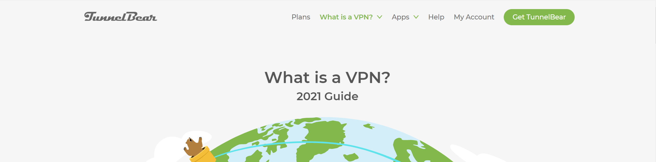
site: tunnelbear.com
Tunnelbear uses a simple technique that blends the navigation bar into the hero / welcome, where we typically see the search bar and welcome message. The background on the header is either the same color as the welcome container, or transparent with the welcome container moved up via negative margins. Tunnelbear has opted to keep the menu right-aligned, opposite the logo.
Another idea: where many websites use the CTA (call to action) button in their navbar, consider what most-used service might be a good candidate for that prime real estate. A note for nailing this approach: remember that whatever color you choose for the navbar background will persist on every page throughout your portal. You can use CSS to alter this so it’s a different color on the homepage if need be, but be aware in case you don’t want the header to be transparent on secondary pages.
Also, extra points for the rad bear illustrations.
Sweatcoin
Site: sweatco.in
Sweatcoin uses a really neat approach that requires the transparent navbar background I mentioned above. Their site is single page, with no dropdown menus. Here I’ll caution you to ensure your text is accessible and legible by ensuring there is appropriate color contrast between your background color and text / link color. Notice on all of these examples, that even with some changing color, there is minimal content in the background of the navbar to prevent distraction. Noisy patterns and images will hinder your users here; opt for images with lots of empty space at the top.
The Landing Page: Tips for Implementation Success
Limit the number of top-level navigation menu items.
It’s easy to create a long menu in the header. Remember that your users will access the site from many different browser window sizes and devices, and a long list can get crowded, difficult to navigate, and do weird line wrapping things when there are too many items and not enough space. If needed, use dropdown menus or consider one of the below more extensive header options for a larger navigation menu.
Ensure proper color contrast between text and background.
I can’t say this enough. Don’t hurt your user’s eyes with text that is hard to read on a noisy background (like a picture with faces or multiple colors and lines), or text that on hover, is barely different than the background color. Users with vision impairments will thank you for making their lives easier. You can test the legibility of your menu items using the color blindness simulator tool found here.
Minimize the number of features to one or two.
Be careful not to overload your user with choices in the header. In addition to the logo and menu, maybe you want to add a search bar or a high-priority action button. If you do, consider minimizing the search bar to expand on hover/click, or choose only one feature to add. Minimalism is key to keeping this style orderly and easy to navigate.
The Double Decker
As its name implies, the “Double Decker” is a header with two levels of navigation. Usually the two levels split into true site navigation on the second level, and more utilitarian features, such as login or search, up top.
Twilio

site: twilio.com
Many public sites use this layout to provide potential customers with easy access to contact information. Twilio has taken this route, along with providing access to support and login access on the top bar. This keeps your main site navigation from becoming cluttered with more functional links. In the case of websites looking to attract customers, this helps separate the links that will lead to new customers from tools that assist existing customers. For our purposes, placing the login / profile functions in the top bar can give you more room to flesh out the navigation for a larger portal.
YNAB (You Need a Budget)

site: youneedabudget.com
YNAB is a personal finance tool for household budgeting. Their website’s main navigation splits up functionality a little differently. The top bar is the actual site navigation, laid out similar to the “Landing Page” method mentioned above, with a limited number of high-priority menu items, login, and search functionalities. The second menu, which is more readily visible and showcases the logo, changes to reflect content specific to different areas of the site. It’s almost a different way to show dropdown menu items, that keeps things (again) orderly and not too overwhelming for the user (again, both bars have a limited number of items, 3-5 ideally).
As a bonus, I’d like to point out that the styles they use for active menu items and on hover are pretty sweet. As you’re designing out your header, remember to consider different styling for different states of your menu links. It should be obvious to the user what part of the site they are currently viewing, and when they are hovering over a link that will take them to another page. My favorite ways to implement this includes underlining text, or changing the font weight, background color, or text color.
Lastly for this example, a word on mobile. As I always preach, put your headers (and all of your widgets) together mobile first. Your users’ experience on a mobile device will be very different, and a header like this that works on desktop can be a cluttered nightmare on mobile if not handled correctly. Below, you’ll see how they handle their mobile audience, by putting many of the menu items behind a hamburger menu, leaving just the page-specific links visible.
The Double Decker: Tips for Implementation Success
Define a purpose for each navbar.
There are a number of different ways you can do this, and the above examples point out a few. Maybe one bar is functional, for search and login, and the other is your actual site navigation. Or perhaps the bottom bar is meant for your end users, and the top meant for your power users and admins. Whatever you choose, make it easy for your users to figure out where they need to be looking for any given item or content type you’ve placed in your header.
Give your user context clues.
Visually indicate to your users that an item will do something if they click on it via effects on hover, active, and focus. This is a great place for some fun animations, to “reward” your users for finding clickable content.
Don’t forget mobile.
Design your header mobile first, to ensure users can easily navigate your content, regardless of the device they use to access it. If you don’t I’ll send some bad CSS ghost to haunt you. Or something.
The Split Decision
At its core, the “Split Decision” header takes the Double Decker and sandwiches the two navigation bars with the welcome hero content. (I’m starting to sound like a deli menu, aren’t I?). This can be helpful for especially wide hero banners, or to provide more separation from an otherwise busy main navigation bar.
/sp
site: Your PDI
The OOB Service Portal has a navigation style that you don’t see often out in the wild. This is the basic layout of the Split Decision, with a functional, single-line header up top, followed by a hero, followed by a second navigation bar filled with the most-needed links.
cough and so this being from my PDI, I gave it a nice pattern from heropatterns once upon a time and didn’t bother to change it back.
Airtable
Site: airtable.com
Airtable uses their second navbar on select pages to serve as page navigation to deal with pages with large amounts of content. The links are pretty simple, and just serve to help you jump down to a particular part of the page. I could certainly see this type of navigation for a single page, though I’d caution you to make sure there is some kind of “return to the top of the page” functionality ready for the user as well.
Another potential use I see is with the Knowledge Base, where the second navbar allows you to easily browse among the different KB categories. For FastGov, the solution I’m building for state and local governments, I’d implement this to show content to different user personas, such as business, resident, visitor.
Duolingo
Site: Duolingo.com
First, we have to acknowledge how perfect the friendly, simple illustrations on this site are. SO CUTE. (Yes, Service Portals are allowed to be cute).
Now, the neat thing about the second navbar is that it scrolls. This works for a few reasons in this very niche use case.
First, all of the listed items are very, very similar. Like, flag icon, one word, that’s it similar. It’s extremely easy for the user to determine where one item begins and another ends. Be cautious about using this with say, your most popular Service Catalog items, if the titles are extremely different in length.
Second, check out this site on mobile. From what I can tell in Chrome, that second navbar disappears. Because the content in this navbar is optional (there are many other ways on this page to access the same content), it’s a nice-to-have on the larger screens, but is removed on mobile so as to not provide unnecessary distraction to the user. And that’s ok!
Similar in function to the out-of-box /sp, I like the more slim, sleek style that Duolingo gives us. Remember, in design of any type, less is more. Especially for a self-service site, where we want users to get in, get out, and get on with their busy days, we want to put in front of them exactly what they need, only when they need it. When more screen real estate is available, offering multiple doors that take you to the right place can do wonders for helping users with different mindsets find what they need.
The Split Decision: Tips for implementation success
Less is more.
Remember, on that second navbar, keep your choices succinct. The spread in navigational choices can prove to be taxing on your user if they constantly have to look above and below a large hero. As mentioned above, define a purpose for this second navbar, and be consistent about the purpose throughout the site.
Use only as needed.
“As needed” can mean a couple of things. In this case, there are two primary things you want to look out for. First, don’t feel the need to provide this layout on every single page. Especially for more functional pages (search results, ticket details, etc), the large hero can get tiresome. Second, carefully consider whether or not this functionality needs to be included on all screen sizes. If the content is otherwise provided to the user in other ways on the page, consider eliminating this second navbar on smaller screens, as DuoLingo implements. If the content is necessary, ensure smaller screens accomodate these links without impeding your user’s progress through the rest of your portal’s content.
No wrong door leads to all the right places.
Jumping off of point #2 above, remember, keep in mind the “no wrong door” approach to site navigation. Your users will come with many different mindsets, which means many different logical paths to get to a certain destination in your portal, be it a knowledge base article, service request, or other special functionality. Having multiple methods for a user to access your portal’s content will help accomodate users and the different paths they tend to take. The second navbar in the Split Decision header, is one of those places for an additional “door” your users can take.
The Sidebar
Maybe I should call this one the Side Dish?…Now I’m hungry. The Sidebar header layout is exactly that. The navigation menu moved from its usual haunt at the top of the site, to the left or right side of the screen as a vertical bar. While quite the departure from the other styles we’ve seen, there are a number of ways to successfully execute the Sidebar to ensure your users find it easy to access and use. As a bonus, there is ALL KINDS of fanciness you can do with sidebar navs.
Amazon
Site: Amazon.com
I hear our Service Portals compared to Amazon for navigation purposes quite often, so I thought this would be a good site to address. Amazon uses the sidebar on their site in addition to a “Double Decker” main navigation bar. There is a ton of functionality packed into their main site navigation, which allows users to browse in the way that is most comfortable with them, whether that be browse by category or search. Note that their sidebar is initially hidden from view.
Functionally, their sidebar is a secondary, optional way to browse site content. When the sidebar is in view, a dark overlay helps our user focus on just the content of the sidebar, to help prevent overloading the user with too many options. This is especially vital with how information-packed their main site navigation already is. Notice the clear visual hierarchy of information here: easy to read category headings help the user know whether or not the links underneath
A note about dropdowns, generally and on the sidebar menus: Bootstrap as it’s implemented in Service Portal, only allows two levels of dropdown menu in the out-of-box header menu widget. If you want more levels of dropdown, you’ll need to amend the widgets to accomodate.
City of Raleigh, North Carolina
Site: CityofRaleigh.gov
If you get me going, I can rant about bad web design in the state and local government space for DAYS (trust me, I timed it once). However, Raleigh, the capital of my beloved home state is not one of the sites to which I direct my ire. City and County websites tend to be packed to overstuffed with information, and navigation is a real challenge with dozens of departments, hundreds of content page, and the ultimate goal of helping the general public find exactly what they need.
Raleigh first presents their users with a very simple one-layer navigation bar with no dropdown menus, that directs users to major portions of the site. Notice the search function here is even minimized to keep the main navbar as clear of clutter as possible.
If you’re looking for more options, however, check out the hamburger menu placed neatly on the left-hand side of the page. On click, it opens up a new menu with an expanded list of options for major areas of the site. Notice that many of these items, instead of official department names, opt for something more user-friendly to the general public (“Trash, Recycling, and Clean Up” vs. “Department of Solid Waste”). On any navigation you choose to incorporate into your portal, keep in mind that for some organizations, traditional names such as “Knowledge Base” or “Service Catalog” may need to change to reflect something that’s easier for users to identify.
The Australian Ballet
Site: Austrailianballet.com.au
Ok, first, GO TO THIS SITE. And then click the hamburger menu. And just know that somewhere, some UI / UX Designer looked at this client, the Australian Ballet, REALLY understood them, and just knocked this web design out of the park. The site starts you off with a simple header, using icons to help call out the most important features: cart, calendar, log in, tickets, and search. To access the rest of the menu, click that hamburger menu and watch as the split menu whooshes into place like two dancers perfectly positioned. It’s the definition of elegance in web design. I am swooning.
Technically, this isn’t a sidebar menu, but I had to include it. The general principal applies, wherein the larger menu is visible only if the user needs it, and tucks away neatly when they don’t. This is a classy way to utilize the full screen for a larger menu in a way that doesn’t overwhelm the user. Generous spacing is given to the different navigational sections of the site, with noticeable headings (Performances, Discover, About Us) that create a distinct visual hierarchy and eliminate the need for bulky dropdown menus.
Continuing the visual hierarchy, the most important secondary information is listed more prominently, with tertiary information listed at the bottom in a muted color. This navigation scheme creates three distinct levels of information, without requiring the user to click multiple times to view all of the items. The spacing, font sizes, and colors used in conjunction with the hamburger menu helps ensure your users have the help they need finding where to focus their attention. I’ll give ample caution, without precisely using different design tools like I just mentioned to create a distinct visual hierarchy, this would quickly become a hard-to-navigate overwhelming mess of a list. However, like the organization it represents, this menu pulls off complex navigation with complete elegance and poise.
The Sidebar: Tips for Implementation Success
Set a sidebar strategy…and stick to it.
Say that three times fast. But really. Decide what your strategy will be, and ask yourself if a sidebar is the best way to handle it. If so, ensure that the content placed in the sidebar has a unified theme: same level of importance, containing only secondary or tertiary information, or same purpose, such as deep-dive category browsing through the knowledge base or service catalog, like we saw with Amazon. Ultimately, we want to avoid forcing users to go back and forth between the primary navigation bar, which is always visible, and the sidebar.
Help users focus on one part of the menu.
There are a number of different strategies we can invoke to help our users focus here. There general principle is to ensure that they are not overwhelmed by having to consider all parts of the menu at once. For Amazon, opening the sidebar creates a dark overlay on the rest of the page, training the eyes toward the active piece of content. For Raleigh, the open sidebar “pushes” the rest of the page slightly offscreen, to make way for the sidebar content as it slides out. And of course, the Australian ballet forces focus by having their menu take up the entire page, coming in from both ends. No matter which method you choose, work to help your user focus on just a select number of choices at a time to help prevent decision paralysis / choice overload.
Create visual hierarchy within the menu
Keeping with our trend of helping our users zero in on the specific content they need to view, work to create visual distinction within your menu items in the sidebar (or any navigation tool, to be honest). Use different font sizes, colors, highlighting effects, etc. to help users distinguish categories of menu items or levels of importance.
Conclusion
I love the clients that give me more creative freedom with their Service Portals. Site navigation is one of those oft-overlooked places that can be a lot of fun to add extra functionality that specifically tailors the experience to the needs of the organization, working with their existing brand and expectations. They do take a little more time to get right, but I’ve found they are well worth the effort, both for function and for the “wow” factor.
Have you had the chance to implement any interesting header designs? Any sites where you found the header to be particularly inspirational? Let me know, I’d love to see!
Quick Tips: Editing the Customer Service Terms and Privacy Statements on the CSM Login Page
ServiceNow’s Customer Service Management (CSM) application comes with a neat feature that allows users to self-register. But how do you configure the Terms of Service and Privacy Policy to reflect your organization’s needs?
So this #quicktip stems from a question a co-worker brought to me a few days ago. ServiceNow’s Customer Service Management (CSM) application comes with a neat feature that allows users to self-register. This is a fantastic feature that allows your public users to access your Service Portal for requests and what-have-you. (My favorite use case: citizen services and request fulfillment for state and local governments. But I’m biased.)
If you’ve ever worked on a CSM project, particularly the Consumer Service Portal (/csp), you’ve seen the out-of-box (OOB) registration screen:

And of course, your organization would like to configure the privacy policy and customer service terms, accessible to users from these links right here:

But these links don’t go to a portal page with a nice widget you can edit. They go to some mystery page with a weird URL:
yourinstance.service-now.com/sn_customerservice_registration_terms_doc.do
for the “Customer Service Terms and Conditions,” and
yourinstance.service-now.com/sn_customerservice_registration_privacy_policy_doc.do
for the “Privacy Policy.”
On top of the weird URL, the pages do not show the header, footer, or anything else you typically see in this portal, breaking stride with the rest of the CSM experience. For the life of me, I couldn’t figure out where these records were so we could change them to fit our client’s needs.
Apparently, this type of URL indicates the use of a UI page. From what I’ve gathered, they are not used near as heavily since Service Portal really took stride. But they’re still there, confounding people like me.
The Solution
To change these links, take the following steps:
Go to the platform view and type “UI Pages” into the Application Navigator, then navigate to System UI > UI Pages.
In the UI Pages search box for the list of records that loads, search for your UI page by name.
Typing “*privacy” will bring up the UI Page for the privacy notice, named registration_privacy_policy_doc.
Typing “*term” will bring up the UI Page for the Customer Service Terms and Conditions, named registration_terms_doc.
If the shortened search doesn’t bring up the pages you’re looking for, try searching in the name field by the exact name.
Open either of the records you selected above.
Edit the HTML field with your content. Be careful to keep your page content within the <div></div> as shown below. Because jelly is scary.

And that’s it. Your Terms and Privacy pages still won’t have the header and footer from the regular CSM portal experience, but it will contain your organization’s information without having to clone or edit that login widget.
Alternatively…
If you are ok with cloning that login widget, another option would be to change the code in said widget to direct those links to the custom CSM page of your choice. Make a public portal page with a widget to contain your policy information, and style as desired. At least this way, you’ll have the CSM portal header and footer there so the text doesn’t look so lonely. Just a thought. :)
What weirdo things have you found in Service Portal? I’d love to know! Please contact me if you have any questions or subjects you’d like to see me address.
My Go-to Style for Panels in Service Portal
In the process of designing custom Service Portals for my clients, I've come across a few tried-and true styles that I find work well in just about every situation.
Today I'm going to share one of these styles that I use for a clean, timeless, and flexible look.
In the process of designing custom Service Portals for my clients, I've come across a few tried-and true styles that I find work well in just about every situation. Today I'm going to share one of these styles that I use for a clean, timeless, and flexible look. I use this style as an alternative to the Bootstrap panel component found throughout the out-of-box (OOB) portal, and I've found it to be a perfect solution for showcasing any information we want to give it's own space.
Bootstrap Panels in Service Portal
First, a little more about Bootstrap panels. At it's core, the Bootstrap panel is just a box you can put stuff in. Like a list of records. Or search results. Or pictures, buttons and links. Whatever you need. Even Bootstrap says so:
"By default, all the .panel does is apply some basic border and padding to contain some content."
Additionally, the Bootstrap panel comes with the ability to add a heading and a footer, which is how it typically looks when we come across it in Service Portal.
The Clean-Panel
This style begins with a clean outer container: the box we will put "stuff" in. You'll notice in the image that the page background is not white. While you can use this style on a white background, I prefer to set the background color of my page or container to a light grey or a very light shade of my primary brand color. This helps the panel and the information it contains pop out on the page, making it more noticeable for our users.

In addition to using the background to our advantage, notice the lack of substantial border. I've used a slight drop shadow and barely-there grey border, to create just enough separation between the widget content and the rest of the page. Additionally, the drop shadow serves to "lift" the panel off the page just a bit. This gives your page a sense of depth, and keeps the page from looking too flat.
Last, the border-radius is set to zero, purely as a preference of mine. I like how crisp sharp corners tend to make a page look. Definitely not a hill I'll die on though. OOB panels have a 4px border-radius.
Our CSS for this panel
.clean-panel{
    box-shadow: 2px 2px 4px 0 rgba(0, 0, 0, .15); /* Sets drop shadow */
    background-color: $panel-bg; /* Set in Portal SCSS variables */
    border-radius: 0; /* Cause I like sharp edges */
    border: 1px solid $gray-lighter; /* subtle border to finish it off */
    display: flex; /* Helps with how content is displayed */
    padding: 15px; /* Give your content space to breathe */
    flex-direction: column; /* Keeps the heading and body from trying to sit beside each other */
    margin-top: 30px; /* honestly this is here so I could get a better screenshot. YMMV */
}
Clean Panel Content: Add some "stuff"
As I said, most Service Portals utilize the typical heading-body-footer panel style, so next we're going to add some content to our panel with these three areas for sake of comparison.
First, the panel heading. As the title of the widget, you usually won’t avoid adding this. I like to use a larger font size to really call attention to what this widget is all about, as well as a bottom border for a punch of color. Notice I'm using the brand colors in small doses here. We don't want to overdo it and cause our users to see the colors and ignore the content. This semi-complete dividing line also serves to separate our heading from the actual content (the OOB panel does this as well).
.cp-title{
  border-bottom: 2px solid $brand-primary;
  padding-bottom: 5px; /*Puts space between your title and the border*/
  width: 100%;
}
For sake of brevity, I've added some good ol' lorem ipsum to fill out our panel body. Normally, this is where you'll add the primary content you want your user to see and act upon, be it a list of records, group of Service Catalog items, links, or even a search bar. Notice that I've put another layer of padding around our content. It's just 15px, but it's enough to inset the content and create a great visual hierarchy. Our users will easily be able to see the heading as the title, and that everything in the panel has to do with our widget's title. The footer, on the other hand, aligns with the header to better indicate that it is relevant for the content body as a whole.
Last, I've put some action buttons in our panel footer. Much like the dividing line between the heading and body, the top border of the panel footer does not entirely connect across the width of our containing box. A subtle line here is all that's needed to create enough of a barrier to let the content of each section stand on its own, and give enough space around each so the entire effect isn't cluttered. Remember, every line and element you put into a panel is something our users have to consider, even if for a fraction of a second. Good design, in part, is ensuring we have removed as much “visual clutter” as possible.
Tips for Implementing this Style
Remember, this style is built to help your users make a decision about what part of your page they need to interact with. Use this style to group similar items together.
Try to mix up the content on your page, some within the panel, some outside. Though the examples below make heavy use of panels, your designs may do well if some information is sitting outside the boundaries of a panel. A panel’s borders create lines of separation you can use from outside the widget as well as inside.
Limit how many items you place in a panel for a user to consider at one time. Five to seven Service Catalog items are easy to choose from. Twenty can be overwhelming.
Whether you’re using this panel style or the OOB panels, if you want to put panels side by side, try to vary the types of content that are next to each other. Three lists of records similarly styled will all run together for your user for lack of distinction, leaving them with one big blob of choices to decipher.
The Clean Panel at Work
Below are a few examples of ways I have used this style in the past. In some of the examples, I’ll put the color on the top border of the panel. This is especially effective if you have elements that have their own defining lines, such as buttons.


As you can see, the clean panel is a flexible enough for a number of purposes in Service Portal, and I’ve found it to be a good approach to freshen up even a simple ITSM implementation. I encourage you to look at this not only as a definitive style you can use, but also as inspiration for new ways of showcasing information. If you’d like to access the update set for the widget I created for this post, feel free to download it here.
Got questions or feedback?
Found an alternative style for grouping information in Service Portal? Anything you want to see me cover? Feel free to reach out, I’d love to hear from you.
Let’s Get this Party Started
I’d been working for GlideFast for about a year when I finally got my act together and joined the SN Devs slack channel.
As it did when I started with GlideFast, my name raised a few eyebrows.
“Interesting last name you have there.”
“That? oh yeah…picked it up a few years back.”…
I’d been working for GlideFast for about a year when I finally got my act together and joined the SN Devs slack channel. As it did when I started with GlideFast, my name raised a few eyebrows.
“Interesting last name you have there.”
“That? oh yeah…picked it up a few years back.”
Or something like that. Not because I’m some amazing developer that’s been on the platform for years. Just by proxy, as the wife of Travis Toulson.
In truth, I’ve been watching over Travis’ shoulder for years now, silently judging his font choices and not-so-silently providing feedback on his portal designs when asked. After one-too-many over-complicated WordPress jobs, he reeled me in with his siren’s song: “This is easier on Service Portal.”
So what business do I, a total newbcakes, have starting a ServiceNow blog?
Well, since beginning this journey, I’ve noticed two things:
First, while many of my fellow developers can code circles around me, I’ve had more than a few admit their reluctance to touch anything front-end or design related. For many of them, portal just isn’t their thing, and they don’t want it to be. Integrations, mid servers, and script includes? They’ve got it covered. But colors and font choices? No thank you. (On the other hand, I would rather stick a hot coal in my eye socket than deal with integrations, and have so much appreciation for those of you that bear that burden so I don’t have to.)
Second, I’ve noticed that while there are many, many resources to help out fellow developers with complex code-related things, there are very few that assist with the design concepts that can make or break the success of a Service Portal experience. From my little corner of the ServiceNow universe, I’m happy to share the knowledge I have.
So, what would you find of interest here?
In short, I’ll do my best to provide four things:
Design inspiration, for those of you looking for yet another way to show off a list of incidents,
Design principles, if you want to understand what makes a good user experience and why it’s important,
Widget code and styles you can use, if you want to find code that gets that certain look and feel JUST how you’re imagining it in your mind. And finally,
Resources: I have my own bag of tricks including pages I frequent, books I refer to, etc. and I am happy to share these with you.
Ultimately, my hope is that my readers walk away from this blog with a higher comfort level with design principles and topics that will equip them to provide their organizations and clients with amazing front-end experiences that encourage user adoption.
And well, if I can turn a few of you into fellow font snobs, all the better. Muahahahaha.
So who’s this for anyway?
This is for the ServiceNow developers. Both the ones new to the game and the ones that have spent 20 years in IT. You’re busy, you have deadlines to meet, and it can take forever to nail down a portal design from scratch (I have in the past spent over six hours just deciding fonts for a portal). Maybe you’ve slain your script include dragons and you’re looking to expand your skill set into Service Portal. Maybe your team is lacking someone to manage your company’s portal and you volunteered (or were voluntold). Either way, I’m sharing what I know in hopes that it will make your job easier.
This is for our end users. In turn, I’m writing so we can better serve the people that actually submit that Service Catalog request by providing experiences that help them get what they need and get on with their day. If they’re comfortable with their experience on ServiceNow, it helps us all succeed.
This is for the designers. The design industry is changing. We are now more problem solvers than “makers of pretty things” (though the things you guys make are gorgeous and I’m jealous for it ‘cause I can’t draw for crap). The ServiceNow platform is a fantastic opportunity to create solutions for some of the biggest brands in the world. I want to bridge the gap between the designers out there in the universe and this platform where design skills are increasingly in need. And finally,
This is for the 15(ish) percent. The very small percentage of ServiceNow developers that happen to be women. You inspire me, and I hope my voice honors the amazing work you’re doing out there.
So how can you be involved?
Got questions or something you’d like to see me cover? Want to show off your work? Want to suggest a better style or way of doing things? Let me know by contacting me here.
I’ve also been encouraged to live stream some of my coding / designing / etc, which I’ll announce on LinkedIn. Which is cool if you want to see me with 20 CSS Tricks browser tabs open. That’ll take place on Twitch.
And of course, I’ll enjoy hearing what you think of the content I post. I’ll leave commentary for LinkedIn.
In Closing…
If you’ve made it this far, there’s hope for me. By Knowledge 2021, I’d like to have posted at least every other week, with something in each of the content areas I mentioned above (client work and all that allowing, as this is after-hours for me). On top of that, I want to give this site a more robust design. For now, I knew that simple was better, as a complete site redesign would hold up the content I’m wanting to deliver. So from here, we’ll see where it goes.